Android Safety UX: Google Play Protect
Welcome to the series of posts on the foundations of safety UX in Android.
This is the fourth blog post in Safety UX series. Previously we were talking what Safety UX exactly is and how package verification works in Android.
I’ve already mentioned how we came to realisation, that Android’s protections need a face and a name - just having something that sits in the background simply doesn’t work. If you remember, I’ve mentioned that we did a foundational study and found that users are expecting us to answer a few fundamental questions, most notably:
- Are they safe right now or not?
- What is one thing they need to do right now to get safer?
Answering these two questions were founding principles of Google Play Protect.
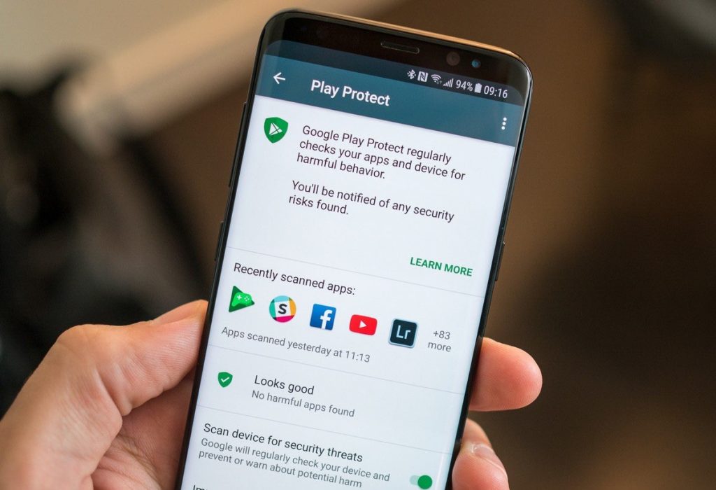
I guess I need to make small excourse into why the feature was named that, and what exactly does it have to do with Google Play. Right now the answer is more or less clear - Google Play Protect comes to the user as a part of Google Play, hence the name. This, however, wasn’t always that way.
First version of Google Play Protect was interesting in the way that we decided on the name and the final UX exactly 6 weeks before Google I/O 2017 where it had to be announced. And - surprise surprise, it shipped in Google Play Services (a.k.a GmsCore). Honestly I don’t remember the exact reason for that - I think it had to do with the fact that GmsCore had easy(ish) integration with Android Settings.

So, the name Google Play Protect was made mainly because of the branding reasons - Google Play was the name that was associated with Google’s layer on top of AOSP Android. Play Protect was incredibly well received and generally hailed as a big breakthrough in the space of end-user security. Except none of it was new.
That’s right - what we built in those crazy 6 weeks was just the UX for what already existed in Android since at least 2013, as described in the earlier post. Very obviously, it was buggy, and very obviously, it wasn’t that good - but it was good enough to answer those two critical questions, at least in first approximation. It was very obvious from the launch results.
And the results were pretty staggering. Every day more than 5M unique users were visiting admittedly very rudimentary page, where they couldn’t even do much. One thing we noticed from looking at UI logs - users were tapping the page in some strange pattern, as if they tried to pull it down; it took us a little time to figure out that what they are trying to do was to rescan their device. Our UXR confirmed that users are expecting a way to re-scan their device for malware.
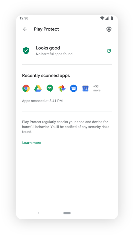
We were wondering: why would users want it? Didn’t we just told them that we scanned their device minutes ago, surely nothing major could’ve changed since then? Turned out, many users were expecting this, for one reason or the other - which is why shortly after launchign the OG version we started to work on redesign - and reimplementation of GPP inside Google Play app. In the retrospect, we could’ve avoided a lot of toil if we had some answers at the very start - however, not only we didn’t have the answers, we often didn’t even know what questions to ask.

Once we launched a redesigned page with (much) better UX and finally - a rescan button - we have seen users opening GPP page, clicking rescan, and then clicking it again. Users were clearly loving it - they were looking for confirmation that they are safe.
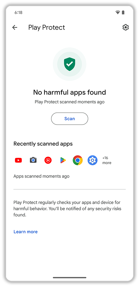
This, however, had an interesting corollary in the sense that since users are seeking for reaffirmation of their safety, our message is evidently not clear enough. This led to the third iteration of Google Play Protect, where we reaffirmed the concept of Safety Status.

In retrospect, this feels like an obvious thing but at that time we realised that users are really looking to have one important question answered straight away - if they are safe. The status shield was addressing exactly that. To the day, Google Play Protect remains the most recognised Google’s brands related to security - and possibly the most recognised security brand ever.
Problem is, it wasn’t enough. What was the problem? Come back later to find out about our next steps in building Android’s Safety UX - there’s a lot more to come.
Update: 5th article in the series is out!