Android Safety UX: Safety Center 2.0
Welcome to the penultimate post of the Safety UX series! In the last post we introduced Safety Center - a unified security surface for all of Android, but the journey didn’t end there. There was a number of problems with this approach and a number of corners to square.
To call out the first and the most obvious one - the way it was built was OK for Pixel, but not OK for the entire Android ecosystem, because it was built in SettingsGoogle - Google’s overlay on top of AOSP’s Settings. This meant two things:
- No other OEMs could take it
- Updating the UX meant full OTA (over-the-air update, full system update)
Frankly, even the first one would be enough, so we had to go back to the drawing board. At that moment in time Project Mainline finally got to the stage that we could use it for just about anything - not only the system logic, but also the UX (I’m not surprised if you never heard about it - Mainline is the pseudo-internal name for Play System Updates, which in essense separates parts of the operating system behind well defined interface and allows to update them out of band via Google Play). we were among the first teams to implement Mainline for user-visible changes - until then it was mainly used for deep-under-the-hood updates, such as codecs.
The second problem was no less obvious - as we’ve mentioned previously, users often do not understand the difference between security and privacy, and yet we deliberately excluded privacy - until now. This was one of the hottest topics of debate: should we include privacy? should it influence the status? how should we deal with the fact that one’s person’s privacy feature is other person’s privacy nightmare? The solution was that we will, in fact, be adding privacy - but would not be includng them into overall status: this means that all privacy warnings will be just recommendations (or FYIs, as we called them) - shown to the user, but not having any colour attached, and not influencing the overall safety status.
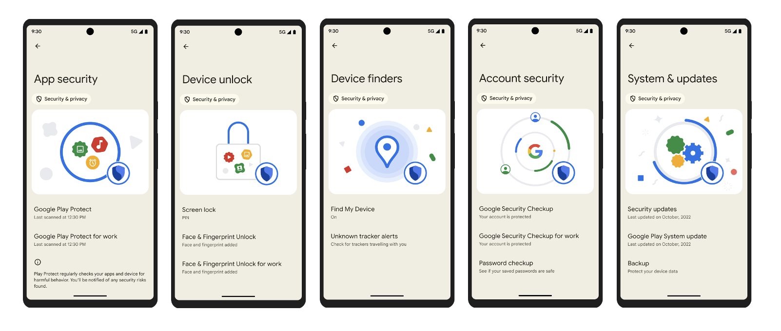
Finally, we realised that adding privacy features to the mix increases the number of categories beynd what users can comprehend. From the past UX research we knew that users can effectively concentrate on 3-5 categories max before developing blindness and effectively just doomscrolling the never-ending laundry list of features. To solve this, we re-grouped all of our features (excluding privacy!) into exactly 5 groups.
Oh and do you remember the story of rescan button in Google Play Protect? We brought that back too! Apparently, even though the surface has changed, users were still loving to hit rescan button and watch fancy animation before receiving the confirmation that they are, in fact, absolutely safe.
All of these features landed over a number of system - and Mainline releases. At this point, we believe the work was mostly done - technical and product work, at the very least. In the next - and last - article of the series I will attempt to draw the line under multiple years of safety UX efforts and try to extrapolate where things should go next. Do you have any thoughts on what future of Safety UX should look like? If you do, drop me a line (or ten) - it would be very interesting to compare our thoughts. Until next time!