Android Safety UX: From Play Protect to Safety Center
Welcome to the series of posts on the foundations of safety UX in Android.
This is the 5th post in the series. Among other things, previously we discussed what is Safety UX, how package verification works in Android and how we built Google Play Protect.
If you remember, in the last post we finished with saying that while introduction of Google Play Protect was a major breakthrough in user safety on Android, it wasn’t quite enough. Why was that?
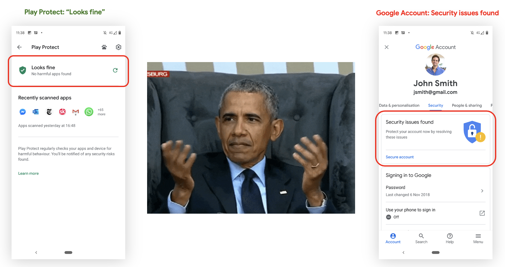
Our own products seemed to contradict each other: Account Security warned the user that multiple security issues were found, while Google Play Protect was claiming that everything was just peachy. In a way, this was working as intended - Google Play protect looks at the app safety story (i.e. it ensures there’s no malware on the device), while the account security advisor focuses on - you guessed it - Google Account security. They both were right - but it didn’t help users any and users were still confused, and it was demonstrated by numerous research 12 that when people are confused they tend to make irrational choices.
But the story didn’t end with Google Play Protect and Security Advisor. There were numerous other security-related surfaces on Android devices, even if you only count Google’s devices. Some of them did provide user a security status, some didn’t. Some gave users controls and knobs to turn, but most were very non-opinionated about what is the “right” state (after all, Android is an operating system, not a policeman!). All of them were using different wording, different visual language, different everything.
In some ways, having multiple security surfaces that tell users conflicting things is worse than having no security surface at all: users get confused, make irrational choices, and ultimately become less safe. Solution?

The thought floating around was very clear - we need to unify all the surfaces.
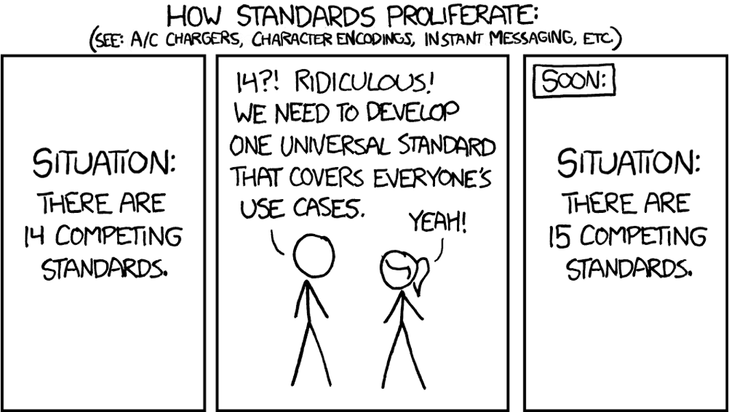
Which was a very clever idea of course - how didn’t we think about that before?! Except of course we did, and it was not the first attempt to achieve this noble goal. Unfortunately, in the operating system as diverse as Android (and a company with as many divisions as Google) it was very, very hard to achieve that level of unification: we had to ensure that not only all sources of safety information were consolidated under the same UI, but also that - no new UI surfaces will be introduced, and eventually all safety-related UI surfaces will be consolidated under the same umbrella. And what we had now was multiple surfaces, broadly incompatible with each other.
Solving this problem required non-trivial amount of not only technical work, but also organisational streamlining - both within Android and Google, as well as the entire Andorid OEM ecosystem. This was a major challenge - stay tuned to find out what happened next!
-
Irrational choice and the value of information, Scientific Reports, Published in Nature. ↩︎
-
Decision-making under uncertainty in media choice, Oxford University Press. ↩︎